A brand sends a Pantone code to the factory. The sample comes back. The blue looks more green than navy. Worse, two shipments of the same product arrive in different shades. Customers notice. Returns rise.
This happens more than most brands think. In fact, color drift of 3-5 Pantone shades is the most common B2B packaging dispute. The reason isn’t bad work. Rather, it’s a small but costly misunderstanding about how pantone color matching actually works on fabric.
Paper takes ink. By contrast, fabric absorbs it. So a Pantone code that looks perfect on a box can shift on a cotton pouch. Even when both share “the same number.”
This pantone fabric guide is for serious brands ordering custom fabric pouches. Think brand owners, packaging designers, and procurement teams. First, you’ll see why fabric color matching breaks the rules of paper printing. Plus, you’ll learn the 3 Pantone systems most brands confuse. And worst of all, you’ll find out which color disasters cost the most to fix.
By the end, you’ll know which Pantone system to use. You’ll know how to send specs suppliers can actually hit. Plus, you’ll learn the 5 most common color mistakes. Honestly, one fixed mistake pays back this guide in a single order. So let’s start with the quick answer.

1. The Quick Answer — Pantone Color Matching in 60 Seconds
Short on time? Here’s the answer in one minute. The rest unpacks every choice in detail.
Pantone color matching for fabric pouches comes down to one rule. Use the right Pantone system. Most brands send the wrong one — and pay for it.
| Pantone system | What it’s for | Use on fabric pouches? |
|---|---|---|
| PMS (solid coated / uncoated) | Paper, plastic, printed packaging | ❌ Wrong system for fabric |
| TCX (Textile Cotton Extended) | Cotton, linen, jersey, velvet, satin | ✅ Use this for most pouches |
| TPX / TPG (Textile Paper) | Color reference on paper, not dyeing target | ⚪ Reference only |
So the short answer: ask your supplier for a TCX color match. Send the TCX code, not the PMS code. Then approve a real fabric lab dip before any production run. That single workflow prevents 80% of color disasters.
2. Why Color Matching Matters More on Fabric Than Paper
Paper printing is precise. Pour the right ink. Press it onto a smooth surface. The color hits the target. Done.
Fabric is different. Very different.
Fabric color matching behaves nothing like paper printing. The reasons matter, so here are the three biggest ones.
First, fabric is porous. Threads absorb dye unevenly. Some fibers take more pigment. Others take less. So a dye batch that looks perfect on one swatch can shift on another.
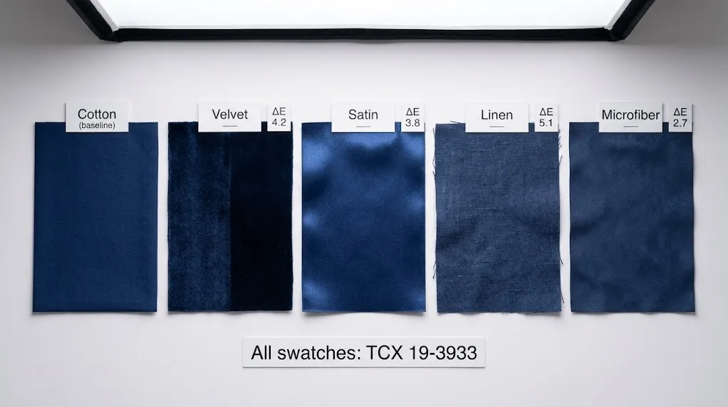
Second, fabric has texture. Light bounces differently off plush velvet than flat cotton. The same dye looks brighter on satin and duller on linen. Yet brands often spec the same Pantone code across all three.
Finally, fabric has direction. Pile fabrics like velvet shift color when the pile leans one way or another. Photo the swatch facing one way. Then flip it. The shade often looks different.
Add it all up, and the math is clear. Fabric is a moving target. A paper-trained Pantone code can hit dead-center on a box but miss on a fabric pouch by 5-8 shades.
So the lesson is simple. Treat fabric color matching as its own discipline. Don’t borrow the workflow from paper packaging. Use TCX codes. Approve lab dips. Check under multiple light sources. We’ll cover each step in detail below.
3. The 3 Pantone Color Matching Systems Brands Confuse
Most pantone color matching disputes trace back to one mistake. The brand sent a code from the wrong system. Then the factory dyed to that code. So the color hit the target — but on the wrong material.
So before any spec leaves your desk, learn the three Pantone systems. The PMS vs TCX choice alone solves most fabric problems.
| System | Full name | Built for | Format example |
|---|---|---|---|
| PMS | Pantone Matching System | Ink on paper, plastic, coated substrates | PMS 286 C |
| TCX | Textile Cotton Extended | Cotton, linen, velvet, satin dyeing | 19-4052 TCX |
| TPX / TPG | Textile Paper Extended | Color reference printed on paper | 19-4052 TPG |
Pantone publishes all three systems. See the official reference at the Pantone color library.
PMS — Built for Ink on Paper
PMS is the system most designers learn first. Designed for printing ink onto paper, plastic, or coated substrates. Codes look like “PMS 286 C” or “PMS 7407 U.” The “C” means coated paper. The “U” means uncoated.
So why does this matter? Sending a PMS code to a fabric supplier is like ordering paint with a fabric swatch. The system was never built for the surface. Suppliers will guess. Guesses miss.
TCX — Built for Dyeing Fabric
TCX stands for Textile Cotton Extended. Created specifically for fabric dyeing. Codes look like “19-4052 TCX.” A six-digit number, then “TCX.”
Each TCX color comes with a real cotton swatch. The swatch was dyed using the actual textile-dye process. So when you spec a TCX code, your supplier matches against a physical reference. That’s the whole point.
TPX / TPG — Color Reference, Not a Dye Target
TPX (now called TPG) is the trickiest of the three. Designed as a paper-printed reference of textile colors. Useful for designers without access to the heavy TCX cotton-swatch book.
However, TPX is not a dye target. Don’t send a TPX code expecting a perfect cotton match. Use it for early design. Then convert to the matching TCX code before sending anything to production.
4. TCX vs PMS — Which One for Fabric Pouches?
Now you know the three systems. So which do you actually use?
For cotton, linen, jersey, velvet, satin, and most blended fabric pouches, the answer is TCX. Always TCX.
Why? Because TCX is the only Pantone system with physical cotton swatches dyed at production scale. Your supplier doesn’t have to interpret a paper reference. They have a real fabric target to match against.
PMS still has a role. Specifically, use PMS for any printed elements on the pouch — silk-screen logos, hot-stamp foil, hangtag printing. Those use ink, not dye. So PMS is the right system there.
Here’s the simple rule: TCX for the bag itself; PMS for what’s printed on top of it.
For a custom velvet or cotton pouch with a printed logo, you’ll send your supplier two codes. One TCX code for the fabric. One PMS code for the print. That single split prevents most color confusion in B2B orders.
If you’re not sure which TCX matches your target color, ask the supplier. Send a physical sample. Or pick from their existing color library. Most factories carry hundreds of TCX-matched stock colors that ship faster than a custom dye batch. Browse our custom fabric pouches for ready color references.
5. CMYK vs Pantone on Fabric — Why B2B Defaults to Pantone
Designers ask this constantly. So let’s settle it. The CMYK vs Pantone debate is over for B2B fabric printing. Pantone wins.
Here’s why.
CMYK is a four-color process. Cyan, Magenta, Yellow, Black. Mix them in different ratios. Get any color you want. It’s how home printers and most desktop print jobs work.
CMYK is great for one thing — photographic images on paper. However, CMYK has two big problems for fabric.
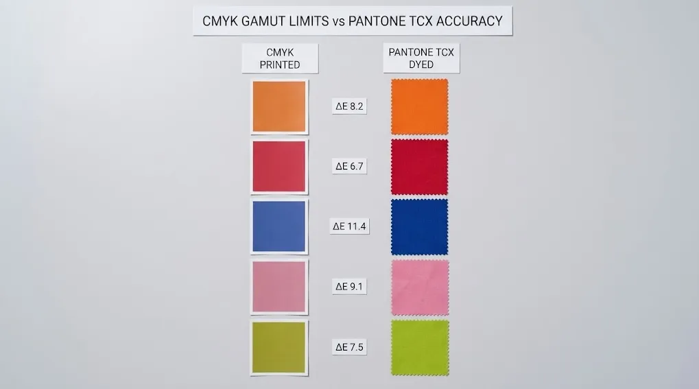
First, CMYK can’t reproduce many colors at all. Bright oranges, deep reds, electric blues, neons — most of these fall outside the CMYK gamut. The printer mixes the closest match. The closest match isn’t close enough.
Second, CMYK drifts. A small change in ink ratio shifts the color. Two print runs of the same CMYK spec rarely match exactly. For a brand that needs the same shade across ten orders, that’s a deal-breaker.
Pantone fixes both problems. Each Pantone code is a pre-mixed, standardized pigment. Suppliers don’t mix from CMYK channels. They dye to a fixed reference. So order one and order ten match.
In short, CMYK is fine for short-run prints on paper. For fabric pouches that carry a brand, use Pantone. It’s not even a close call.
The good news: most fabric pouch suppliers default to Pantone anyway. So you usually only need to confirm the TCX system.
6. How to Send Color Specs to a Supplier (7 Steps)
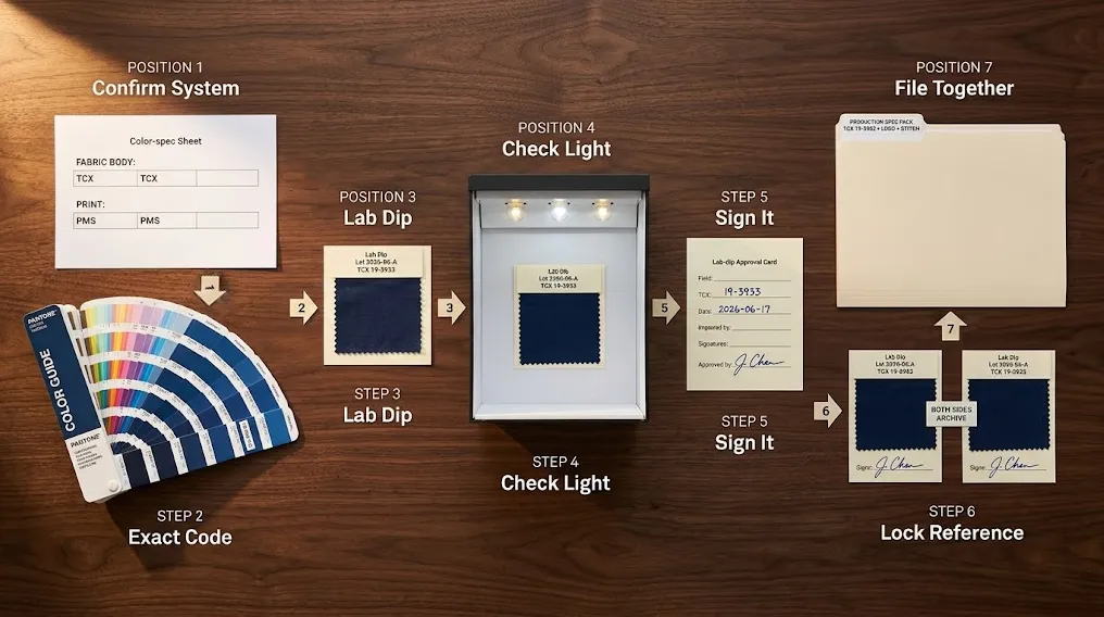
Color spec is where many brands lose control. A vague brief leads to a vague sample. A vague sample leads to color drift across orders. The fix: a tight 7-step workflow.
Step 1: Confirm the System (TCX, Not PMS)
Lock the system before anything else. For the fabric body, send TCX. For any printed element, send PMS. State both clearly in the brief.
Step 2: Provide an Exact Code, Not a Word
“Navy blue” has hundreds of shades. “19-3933 TCX” has one. Always send the code. Never send only the word.
Step 3: Request a Physical Lab Dip
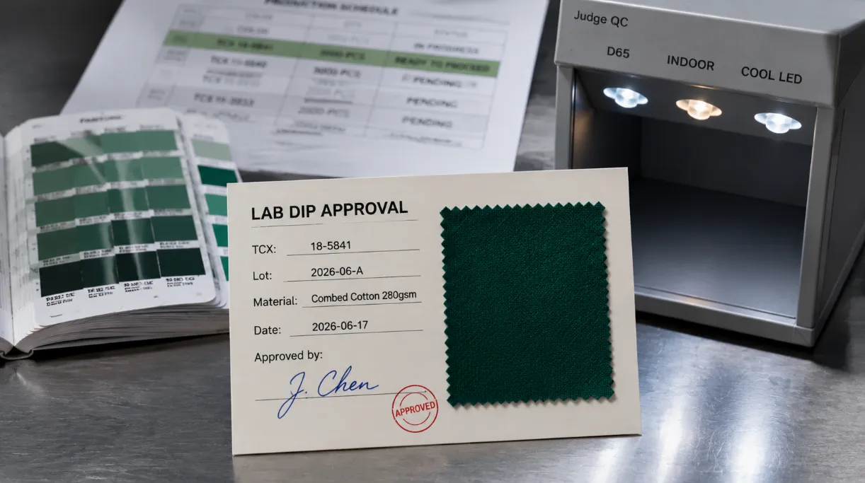
A lab dip is a small fabric swatch dyed to your code. Approve it physically. Don’t approve a screenshot. Screen color and dye color are not the same thing.
Step 4: Check Under Multiple Light Sources
View the lab dip in daylight, then under warm indoor light, then under cool LED. Some colors shift dramatically between light sources. We’ll cover this in detail in the next section.
Step 5: Approve the Dip, Then Sign It
Once you accept the color, sign the lab-dip card. Mark the TCX code, the date, and your initials. That signed swatch becomes the reference for every future production run.
Step 6: Lock the Reference in Both Sides’ Files
Keep one signed swatch. Send one to the supplier. Photograph both for digital records. So if a future shipment looks off, you can compare against a signed reference — not a vague memory.
Step 7: File the Color Spec with Other Production Specs
Don’t keep the color spec separate. Bundle it with the logo file, print method, and stitch spec. One file, one source of truth. For tips on protecting other production details, see our logo durability guide.
Follow these seven steps and color drift basically stops. The first three are mandatory. The last four are insurance.
7. How Lighting Changes Fabric Color
Lighting changes everything about how a color looks. So even a perfect lab dip can look wrong under the wrong light.
This is called metamerism. Two colors that match under one light source can look different under another. It’s the same dye. The same fabric. Just different photons.
Three light conditions matter for fabric pouches.
First, daylight (D65). The industry-standard reference light. If your color looks right in pure daylight, it’ll usually look right almost everywhere.
Second, warm indoor light (incandescent, soft LED). Pulls warm tones forward. Reds get brighter. Cool tones get muddy.
Third, cool LED or fluorescent. Pulls cool tones forward. Blues sharpen. Warm tones go flat.
Smart brands check lab dips in a light box. The box has three or four switchable bulbs that simulate each standard. So you see how the dye looks under every condition before approving.
Don’t have a light box? Then check the dip outside (D65), under your office light, and under your phone flashlight. The shifts will reveal themselves. If a color looks fine in daylight but bad indoors, you have a metamerism problem. Pick a different dye lot.
8. Why the Same Pantone Code Looks Different on Velvet vs Cotton
Here’s the part of fabric color matching that surprises most new brands. Send the same TCX code to a factory. Order a velvet pouch and a cotton pouch in that code. The two will look different.
This isn’t a mistake. Rather, it’s physics.
Velvet has pile — short threads standing up. Light hits the pile, bounces around, and absorbs into the surface. So velvet looks deeper, richer, and darker than the same dye on flat cotton.
Cotton has flat weave. Light reflects more directly. So the same dye looks brighter and cooler than on velvet.
Satin is more extreme. Smooth surface, high sheen. The dye reads almost glowing on satin. On linen, with visible texture, the dye looks rustic and slightly faded.
So when a brand specs “one TCX code for all materials,” they’re not specing one color. Rather, they’re specing one dye that produces five different visual results.
What do you do about it? Two options.
Option one: Accept the difference. Pick the TCX that looks best on your hero material. Then let other materials shift naturally.
Option two: Pick a different TCX per material. Use slightly different codes for each fabric. This costs more setup but locks in visual brand consistency.
For a deeper material comparison, see our velvet vs microfiber comparison. Or browse our velvet and cotton pouch collections.
9. Common Pantone Color Matching Disasters & How to Prevent Them
Even careful brands hit color problems. Here are the five most expensive ones — and the fix for each.
Mistake 1: Sending PMS Instead of TCX
The classic. Designer pulls a PMS code from a Pantone book. Sends it to the factory. Expects a fabric match. The factory dyes the closest fabric color. Result: 4-7 shade drift. Fix: always send TCX for fabric body.
Mistake 2: Approving Color on Screen, Not on Fabric
Every screen displays color differently. A blue that looks rich on your monitor can ship as a muddy navy. Fix: never approve a production color without a physical lab dip in your hand.
Mistake 3: Checking Color in Only One Light Source
Office light hides shifts that daylight reveals. So a dip that looks perfect under indoor LED can look wrong outdoors. Fix: check under at least two light sources — preferably daylight, indoor, and cool LED.
Mistake 4: Using the Same Code Across Different Materials
A TCX code on velvet, cotton, and satin produces three different looks. Brands that expect identical visual color across materials get burned. Fix: either accept the variation or pick slightly different TCX codes per material.
Mistake 5: No Signed Swatch on File
Six months later, a new batch arrives and the color looks off. Who’s right? Without a signed reference swatch, the argument has no ground truth. Fix: sign and file a reference swatch for every approved color.
Prevention is cheaper than rework. A signed swatch costs nothing. A re-dyed 5,000-unit batch costs thousands. Always lock the reference.
10. Conclusion — Pantone Color Matching Is a Brand Promise
Let’s bring it back to the start. Pantone color matching on fabric isn’t just a technical step. Rather, it’s a brand promise. Customers expect the blue today to match the blue six months from now.
The logic is short. First, use TCX for fabric and PMS for print. Second, send codes — never color names. Third, approve physical lab dips, not screenshots. Fourth, check under multiple light sources. Finally, sign every reference swatch and file it.
Do that, and color drift basically disappears. Your brand stays consistent across runs, materials, and years. That’s how small color discipline turns into customer trust.
This pantone fabric guide gives you the workflow. The rest is execution. Visit YJXpack for a color-matched custom pouch quote.
11. FAQs
Q1: Can I send a PMS code to my fabric supplier?
Yes, but only for printed elements like silk-screen logos or hot-stamp foil. For the fabric body itself, send a TCX code instead. PMS was built for ink on paper. TCX was built for dye on cotton. Mixing them up is the single most common B2B color mistake.
Q2: What’s the difference between TCX and TPX/TPG?
TCX comes as a real cotton swatch. TPX (now called TPG) is a paper-printed version of the same color reference. Use TCX as the dye target. Use TPX only for early design when you don’t have a cotton swatch handy. Don’t send TPX as a production target.
Q3: How do I find the TCX code for a color I have?
Use the Pantone Connect app or a TCX color guide book. Both let you match a physical sample to the nearest TCX code. For best results, take the match in daylight on a white background. Then confirm by ordering a small lab dip from your supplier.
Q4: How long does a lab dip take?
About 5-10 working days for most fabric pouch suppliers. Some factories with in-house dye houses can turn one in 3-5 days. Rush options exist but cost more. Build the lab-dip step into your timeline before placing any production order.
Q5: How much color drift is normal for fabric pouches?
Generally, the industry tolerance is Delta E 3.0 or less for fabric — slightly looser than paper. Anything beyond Delta E 3.0 is visible to most customers. Reject batches above that threshold. A signed reference swatch makes this dispute objective, not subjective.
Q6: Can I match a Pantone color across velvet, cotton, and satin?
Most brands get close, but not identical. The fabric structure changes how light reflects. So a TCX code reads slightly different on each material. The cheapest fix is to accept the natural variation. A more rigorous fix is to pick a different TCX code per material to balance the visual look.
Q7: Do all suppliers carry the full TCX color library?
Color libraries vary widely. Bigger fabric pouch factories carry hundreds of TCX-matched stock colors that ship faster than custom dye batches. Smaller suppliers may match only common shades. Ask for the stock color list before specifying a custom dye. It can save 10-15 days and a setup fee.
Get a Quote — Custom Pantone-Matched Fabric Pouches
YJXpack — Yijiaxin (Shenzhen) Packaging Co., Ltd.
For 20+ years, we’ve made custom fabric pouches — cotton, velvet, microfiber, satin, drawstring, zipper — with strict TCX-based color matching for brand owners, traders, and e-commerce sellers across the US, Europe, and the Middle East. We hold OEKO-TEX, GRS, GOTS, BSCI, ISO 9001, and SABER certifications, and we share full certificates with serious buyers before any commitment.
Want to see and feel the real thing? Request a free sample pouch — we ship to your door at no cost so you can check fabric weight, color accuracy, and stitch finish before placing an order.
Email: info@yjxpack.com
WhatsApp / WeChat: +86 18617112946
Website: www.yjxpack.com
Free sample shipped to your door · Quote within 3 minutes · 3D mockup in 30 minutes · Sample in 1–3 days · MOQ 100 pieces · GOTS / GRS / OEKO-TEX / BSCI / ISO 9001 certified
Share This Story, Choose Your Platform!