You sent your brand’s signature red — Pantone 186 C — to the supplier. The sample arrives. The bag looks… close. But not quite right. Slightly orange. A bit darker. Your marketing director squints and says, “This isn’t the red we use.”
So you ask the supplier to re-do it. They send another sample. Still off. Different off, but still off. After three rounds and $200 in sample fees, you finally realize what nobody told you. Pantone color matching on fabric is not the same as Pantone color matching on paper.
This guide explains exactly why that happens and how to avoid it. Here’s the problem with most online color articles. They treat Pantone as one universal system. Plus, they don’t tell you about TCX vs PMS/C. And worst of all, they skip the part where fabric absorbs ink differently than paper.
This article fixes that. In plain English, you’ll learn three things. First, what Pantone color matching actually means for fabric packaging. Second, the TCX vs PMS distinction that almost every brand misses on their first order. Third, real tolerances, costs, and a workflow you can hand to any supplier.
By the end, you’ll never get a “close but wrong” sample again.
1. Pantone Color Matching — The 1-Minute Quick Answer
Let’s skip ahead. Here’s the bottom line.
Pantone color matching for custom pouches works — but you have to use the right Pantone system. Specifically, for dyed fabric (the bag body), use Pantone TCX. For printed logos on fabric, use Pantone PMS/C with a fabric tolerance disclaimer. As a result, mismatching these two leads to the most common sample rejection in B2B packaging.
Naturally, the right approach depends on your application. Here’s the fast-look table.
| Use Case | Pantone System | Typical Tolerance |
|---|---|---|
| Dyed fabric body (bag color) | Pantone TCX (Textile) | ±2 dE on standard fabrics |
| Printed logo on light fabric | Pantone PMS / Solid Coated | ±3 dE typical |
| Printed logo on dark fabric | PMS with white underbase | ±4 dE typical |
| Embroidered logo | Thread color chart (not Pantone) | Closest match available |
| Hot-stamped foil logo | Foil color chart (limited Pantones) | Exact foil match |
That’s the fast version. Now let’s break it down properly.
2. What Is Pantone Color Matching? (Explained for Brands)
Pantone is a global color standardization system used in design, packaging, and manufacturing. Specifically, every Pantone color has a unique code. So when your design team specifies “Pantone 186 C,” any supplier anywhere in the world should be able to reproduce that exact shade.
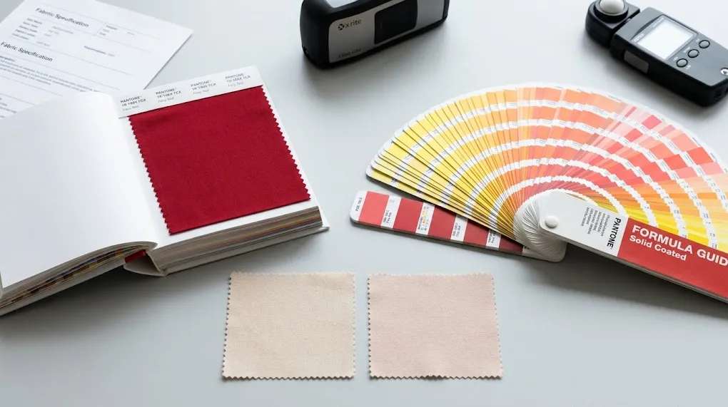
That’s the theory. Here’s the reality. Pantone isn’t one system — it’s a family of systems, each designed for a different material. Paper has one Pantone library. Fabric has another. Plastic has a third. Each library has different physical color swatches because the same pigment looks different on different surfaces.
For custom pouch brands, three Pantone systems matter most. First, PMS/C (Pantone Matching System, Coated) — designed for printed inks on coated paper. Second, PMS/U (Uncoated) — the same colors but on uncoated paper. Third, TCX (Textile Cotton Extended) — designed specifically for dyed cotton and textile fabrics.
Naturally, brands designing logos in Adobe Illustrator usually pick from the PMS/C library by default. So when they send “Pantone 186 C” to a fabric supplier, they’re sending a paper-coated reference. The supplier then has to interpret that reference onto fabric — which behaves very differently from paper.
This is the root cause of “the red looks orange” complaints. It’s not the supplier’s fault. It’s a system mismatch. Specifically, the design was specified in a paper-based system but executed on a fabric.
3. Pantone TCX vs PMS/C — The Distinction Most Brands Miss
This is the single most expensive mistake in custom pouch color matching. So let’s clear it up.
| Property | Pantone TCX | Pantone PMS / Coated |
|---|---|---|
| Designed for | Dyed textiles, cotton, fabric | Printed inks on coated paper |
| Physical swatch | Actual dyed fabric square | Printed paper card |
| Use case for pouches | Bag body color (dyeing) | Logo printing (screen/DTF) |
| Total color count | ~2,625 colors | ~2,394 colors |
| Library cost | $450-650 | $200-300 |
| Cross-conversion possible? | Approximate only | Approximate only |
Three things every brand should know.
First, TCX is for dyeing the fabric itself. If you want a “Pantone 19-1664 TCX Fiery Red” cotton bag, the entire fabric is dyed that color. The dye is mixed to match the TCX reference. As a result, the color goes all the way through the fiber — not just printed on top.
Second, PMS/C is for ink printed on fabric. If you want a “Pantone 186 C” red logo screen-printed onto a white cotton bag, the ink is mixed to match the PMS/C reference. The fabric stays its original color. The ink sits on top.
Third, these two systems are not directly interchangeable. There is no exact TCX equivalent of PMS 186 C, and vice versa. Pantone publishes approximate cross-conversion charts, but the actual visual result will differ. Specifically, even when the codes claim to be “equivalent,” your eyes will see two different reds.
So the practical rule is simple. For dyed bag bodies, specify TCX. For printed logos, specify PMS/C. By contrast, mixing them up is the #1 source of B2B color disputes — and 90% of brands do this on their first order.
4. The Color Card Workflow — How It Actually Works
The most professional sourcing teams follow a standard color card workflow. So here’s exactly how it goes.
Step 1: Design specification. Your design team specifies the Pantone color with full code. For example, “Pantone 19-1664 TCX Fiery Red” or “Pantone 186 C.” Naturally, include both fabric body color and logo color separately.
Step 2: Send the physical Pantone color card. Don’t just send the code by email. Physically mail a real Pantone TCX swatch (a small dyed fabric tab) or PMS card to the supplier. The supplier needs the physical reference because monitor colors are unreliable for matching.
Step 3: Supplier dye-lab or ink-mix. The factory’s color lab mixes a custom dye or ink batch to match your physical reference. Then they apply it to your specified fabric and document the result.
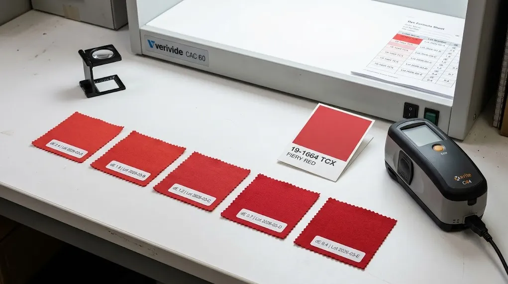
Step 4: Lab dip submission. The supplier sends back 2-3 small fabric squares (called “lab dips”) for your approval. Each lab dip is labeled with the Pantone reference and a delta-E measurement showing how close it is to perfect.
Step 5: Approval or adjustment. You compare the lab dip to your original Pantone card under D65 daylight (or natural light). If it matches, approve in writing. If not, request specific adjustments — “slightly darker,” “less orange undertone.”
Step 6: Production-locked formula. Once approved, the supplier locks the dye/ink formula for your order. Future re-orders of the same SKU should hit the exact same color. So this is why a documented custom pouch color match saves money on every future order.
The whole workflow takes 7-14 days for a first-time color. By contrast, skipping it and “just sending the code” leads to 2-4 sample rejection cycles — much slower and more expensive.
5. Pantone Color Matching Tolerances on Fabric
“Perfect match” doesn’t exist in fabric dyeing. So let’s talk realistic tolerances.
Color difference is measured in “delta-E” (dE). It’s a number representing how different two colors look to the human eye. Specifically, the lower the dE, the closer the match. Here’s what to expect on real fabric color matching.
| dE Range | Visual Result | Industry Standard For |
|---|---|---|
| 0 – 1 | Perfect match, indistinguishable | Lab conditions only (unattainable at scale) |
| 1 – 2 | Excellent, almost identical | Premium luxury brands |
| 2 – 3 | Very close, professional grade | Most B2B custom orders |
| 3 – 5 | Acceptable, slightly different | Standard promotional orders |
| 5+ | Noticeable mismatch | Reject and re-do |
Three insights here.
First, dE ≤ 3 is the realistic professional standard. Specifically, expecting better than dE 2 on standard cotton or canvas is unrealistic — even premium factories struggle below dE 2 because fabric absorption varies between bolts.
Second, light colors are harder to match than dark colors. Pastels, pinks, and creams show even tiny variations in undertone. By contrast, deep navy and black are forgiving.
Third, white is a special case. Fabric “white” varies wildly — bleached white, natural white, cream white, optical white. Always specify the exact white reference (e.g., “Pantone 11-0601 TCX Bright White”) rather than just “white.”
For more on fabric specification, see how we approach fabric color matching across our cotton tote bags production lines.
6. Best Fabrics For Accurate Pantone Color Matching
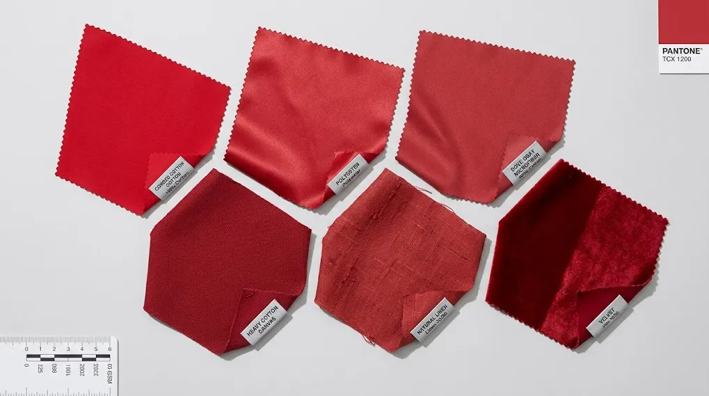
Fabric type dramatically affects color match accuracy. So choose carefully if precise color matters.
| Fabric | Color Match Accuracy | Notes |
|---|---|---|
| 100% combed cotton | ✅ Excellent | Smooth fiber takes dye uniformly |
| Cotton canvas | ✅ Excellent | Dense weave, consistent dye uptake |
| Polyester satin | ✅ Very good | Synthetic fibers dye predictably |
| Velvet | ⚠️ Variable | Pile direction creates light/dark patches |
| Linen | ⚠️ Variable | Natural slubs absorb dye unevenly |
| Organic cotton | ✅ Good | Slightly more variation than conventional |
| GRS recycled cotton | ⚠️ Variable | Fiber blend can shift hue 1-2 dE |
| Microfiber | ✅ Excellent | Smooth polyester fiber, uniform color |
Three practical patterns.
First, synthetic and smooth fabrics dye most predictably. Polyester satin and microfiber take Pantone matching to dE 1-2 consistently. So if exact brand color is critical, consider satin pouches over textured natural fabrics.
Second, natural fibers introduce variability. Cotton is mostly fine, but linen, hemp, and recycled blends show more visible dye variation. By contrast, that “rustic” character is often a feature for eco brands — not a bug.
Third, pile fabrics like velvet are inherently directional. Light reflects differently depending on pile direction. As a result, the same dye batch can look two different shades depending on how the fabric is cut. Most factories control this with directional cutting, but it adds complexity. For velvet jewelry pouches, expect dE tolerance of 3-4 rather than 2-3.
One last note. If you’re sourcing certified organic or recycled fabric (GOTS, GRS, OEKO-TEX), color matching gets a bit harder because dyes must also meet certification. The GOTS organic standard restricts certain chemical dyes, narrowing the available color palette. So discuss this with your supplier early.
7. When Pantone Color Matching Gets Expensive
Standard Pantone matching is usually included in supplier quotes. But three scenarios push the cost up sharply. So watch for these.
| Scenario | Cost Impact | Why |
|---|---|---|
| Custom non-Pantone color | +$50-150 setup | Lab must mix from scratch, no reference |
| Fluorescent or neon Pantone | +30-50% material cost | Special dyes required, smaller suppliers |
| Metallic Pantone (gold, silver) | Switch to foil method | Can’t truly dye fabric metallic |
| Pantone match below dE 2 | +$80-200 lab fee | Multiple lab dips, premium QC |
| Multiple Pantone colors per bag | +$30-50 per color | Each requires separate dye batch |
| GOTS-compliant dye for Pantone | +15-25% dye cost | Certified dyes are pricier |
Three things to budget for.
First, custom non-Pantone colors are surprisingly expensive. If your brand color isn’t in the Pantone library, the factory has to mix from your physical sample — and that adds setup cost. So if possible, choose a Pantone reference your supplier already has on file.
Second, neons and metallics are special cases. Fluorescent dyes use different chemistry than standard dyes. As a result, only specialty factories handle them well, and prices go up 30%+. For metallic effects, switch to a foil-based logo method rather than dyed fabric. We covered the cost trade-offs in our logo printing cost comparison.
Third, tighter tolerance equals higher cost. Requesting dE ≤ 2 is reasonable but adds lab fees. By contrast, accepting dE ≤ 3 dramatically reduces sample iterations and total cost. So define your tolerance up front based on actual brand sensitivity.
8. Pantone Color Matching for Different Logo Methods
Each logo method handles Pantone differently. So here’s the practical breakdown.
| Logo Method | Pantone Compatibility | Recommended System |
|---|---|---|
| Screen Printing | ✅ Full Pantone support | PMS/C (Coated) |
| DTF Printing | ⚠️ CMYK approximation | Close match, not exact Pantone |
| Embroidery | ⚠️ Thread color chart | Closest thread to Pantone |
| Hot Stamping | ⚠️ Limited foil palette | Closest foil to Pantone |
| Heat Transfer (Vinyl) | ✅ Standard Pantone vinyl | PMS-matched vinyl rolls |
Three practical rules.
First, screen printing is the gold standard for Pantone match. Specifically, the ink mixer formulates each color to match your PMS reference exactly. As a result, you can achieve dE ≤ 2 reliably. See our deep dive on screen printing on fabric for setup details.
Second, DTF uses CMYK process inks, not spot Pantone inks. So while DTF can approximate any Pantone color, exact spot-color match is not guaranteed. For brand-critical colors at small quantities, DTF + manual review is the practical compromise. Full details in our DTF printing for pouches guide.
Third, embroidery and hot stamping force you into a limited color palette. Thread manufacturers offer 200-400 standard colors, mapped approximately to Pantone. Foil manufacturers offer even fewer — about 30-60 standard foils. So pick your method first, then choose Pantone from the available palette.
9. 5 Common Color Matching Mistakes Brands Make
After 20 years of B2B orders, the same five mistakes show up repeatedly. So avoid these.
Mistake 1: Specifying PMS/C for fabric dyeing. The most common error. PMS/C is for printed inks, not dyed fabric. So your supplier ends up “approximating” — and the result is usually wrong by dE 4+. Use TCX for fabric body color, period.
Mistake 2: Sending only the Pantone code, no physical card. Pantone codes describe color in theory. However, screens, printers, and human memory all interpret them differently. So always mail the physical Pantone reference card to the supplier.
Mistake 3: Approving lab dips under bad lighting. Office fluorescent lighting shifts color perception. Naturally, a lab dip approved under fluorescent light may look wrong in daylight. So always inspect under D65 standard daylight or near a north-facing window.
Mistake 4: Ignoring fabric character. A bright Pantone red looks slightly different on cotton, canvas, satin, and velvet — even with identical dye formula. So evaluate the color on the actual fabric you’re ordering, not on a generic reference cloth.
Mistake 5: Skipping the formula lock. After lab dip approval, ensure the supplier documents the exact dye formula and pantone color card reference for your order. Without this, re-orders 6 months later may shift by dE 2-3 — and your “consistent brand color” isn’t.
Pantone color matching gets dramatically easier once these five mistakes are avoided.
10. Conclusion — Pantone Color Matching Decision Test
Skip the long analysis. Instead, use this 60-second test.
Ask yourself four quick questions:
1. Is the color for the bag body (dyed fabric)? → Use Pantone TCX.
2. Is the color for a printed logo on fabric? → Use Pantone PMS/C.
3. Is brand color absolutely critical? → Specify dE ≤ 2 and pay for lab dips.
4. Is the fabric textured (velvet, linen, recycled)? → Accept dE 3-4 tolerance.
If you answer these four before quoting, your supplier discussion shortens from weeks to days. Pantone color matching packaging projects become predictable instead of frustrating.
That’s it. Sixty seconds. Real answer.
11. FAQs
Q1: What’s the difference between Pantone TCX and PMS/C?
TCX is for dyed textiles — physical fabric swatches dyed to specific colors. PMS/C is for printed inks on coated paper. Specifically, you use TCX when specifying the color of fabric itself (the bag body), and PMS/C when specifying ink colors for printed logos. So these are two different reference systems, not interchangeable.
Q2: Can a Pantone color be perfectly matched on fabric?
Not perfectly, but very close. The realistic professional standard is dE ≤ 3 for most B2B fabric orders. By contrast, lab-condition perfection (dE < 1) is achievable only in controlled testing, not at production scale. So set realistic tolerance expectations upfront with your supplier.
Q3: Do I need to physically send a Pantone card to the factory?
Yes, always. Pantone codes describe color in theory, but monitors and printers interpret them inconsistently. So sending the physical card eliminates ambiguity. Reputable suppliers will request this anyway before quoting precision color jobs.
Q4: How much does Pantone color matching cost?
Standard Pantone matching is usually included in supplier quotes — no extra fee for common library colors. However, custom non-Pantone colors add $50-150 setup. Specifically, tight tolerance jobs (dE < 2) add $80-200 in lab fees, and certified organic/recycled dye matching adds 15-25% to material cost.
Q5: Why does my Pantone red look different on different fabrics?
Because fabric texture, fiber type, and weave all affect light reflection. A Pantone 186 C on smooth polyester satin looks brighter than the same dye on a textured natural cotton canvas. As a result, you should always evaluate color on the actual fabric you’re ordering — not a generic test swatch.
Q6: Can I trust the Pantone Connect app for color matching?
For initial design specification, yes. The app is reliable for converting between Pantone systems and finding closest matches. However, for production approval, you still need physical Pantone cards and supplier lab dips. So the app is a starting point, not a substitute for physical reference.
Q7: How long does Pantone color matching take?
Typically 7-14 days for a first-time color from receipt of physical Pantone card to lab dip approval. Specifically, complex colors or certified-fiber projects can take 14-21 days. By contrast, re-orders using a documented formula take zero extra time — production starts immediately.
Get a Quote — Custom Pouches With Pantone-Matched Colors
YJXpack — Yijiaxin (Shenzhen) Packaging Co., Ltd.
For 20+ years, we’ve executed Pantone color matching for B2B custom pouch orders across cotton, canvas, satin, velvet, microfiber, and certified organic/recycled fabrics. Our in-house color lab achieves dE ≤ 2 on smooth fabrics and dE ≤ 3 on textured natural fibers. We hold GOTS, GRS, OEKO-TEX, BSCI, ISO 9001, and SABER certifications, and we serve over 8,000 brands worldwide.
Want to test our color matching? Mail us your Pantone card (TCX or PMS) and we’ll send back 2-3 lab dips on your specified fabric for free. Compare them under D65 daylight before committing to any order.
Email: info@yjxpack.com
WhatsApp / WeChat: +86 18617112946
Website: www.yjxpack.com
Free lab dips on your specified fabric · Pantone TCX & PMS supported · dE ≤ 2 on smooth fabrics · MOQ 100 pieces · GOTS / GRS / OEKO-TEX / BSCI / ISO 9001 certified
Share This Story, Choose Your Platform!