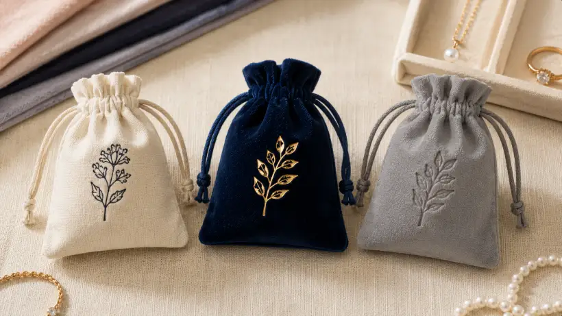
A custom jewelry pouch can protect a ring, pendant, or bracelet while creating a visible brand touchpoint during gifting, unboxing, and retail display. For B2B buyers working with YJXPACK, the right logo method depends on the selected fabric, usable decoration area, artwork detail, pouch structure, and intended visual effect. A foil mark may suit a simple wordmark on a stable flap, while artwork with fine detail may be better evaluated for printing. The practical goal is to select a method that the chosen material and logo can reproduce consistently after sample approval.
Quick Summary
- Select the pouch fabric and construction before finalizing the logo process. A method that works on a flat flap may perform differently on a gathered drawstring pouch.
- Consider print for artwork with fine lines, small type, several colors, or tonal detail. Review coverage and edge quality on the actual fabric.
- Consider foil for bold, simple artwork when a metallic or low-reflective finish is desired. Fabric pile, texture, coating, and logo size can affect transfer results.
- Consider debossing or embossing only after confirming that the material can show and retain an impression. A physical sample is important because depth and visibility vary by material.
- Consider embroidery when thread texture supports the intended brand look and the pouch can support stitching without unwanted distortion.
- Approve artwork and a physical pouch sample before bulk production. Written approval should cover fabric, logo size, location, color reference, and acceptable variation.
Start With the Information a Supplier Needs
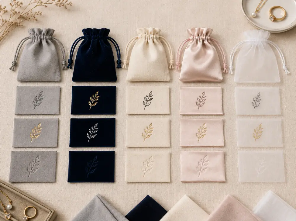
A useful logo decision starts with a clear sourcing brief. State the pouch style, finished size, fabric, color, closure, logo artwork, placement, and intended use. A supplier cannot make a sound process recommendation from a logo file alone because the same design can behave differently on velvet, microfiber, canvas, satin, or organza.
Buyers should identify the usable decoration area instead of relying only on the overall pouch dimensions. A small flap may leave limited room after seams and edge allowances. On a drawstring pouch, the gathered top and side seams can reduce the area that stays flat after filling. This guide to information a pouch manufacturer needs for an accurate quote can help buyers organize details before the first inquiry.
Pouch construction matters as much as fabric. Flap pouches often offer a more stable panel for a centered logo, while drawstring styles can create a softer, more casual presentation. Review drawstring and flap jewelry pouch formats before approving placement, especially when a logo sits near a fold, seam, or drawstring channel.
Material selection should happen early, not after artwork approval. A smooth surface may show small lettering more clearly, while a textured or piled fabric can change the visible edge of a fine line. For a buyer-focused comparison, see the cotton, linen, and velvet pouch material guide.
If a customer, retailer, or internal compliance team refers to a named standard, ask for the exact standard and test scope. The ISO standards catalogue is an authoritative source for checking standard terminology. However, a catalogue listing does not show that a pouch, fabric, or logo process meets any particular requirement.
Match the Logo Method to Fabric and Pouch Structure
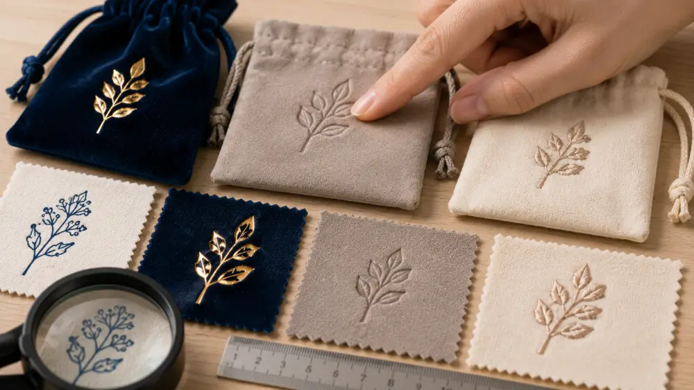
No material automatically produces the same decoration result. Fabric thickness, pile direction, weave density, backing, dye, surface finish, and artwork size can all influence the final appearance. Use the following table as a starting point for discussion and sampling rather than as a production promise.
| Pouch Material | Surface Characteristics | Logo Methods Often Evaluated | Points to Confirm During Sampling |
|---|---|---|---|
| Velvet | Soft pile with changing light reflection | Foil, simple print, and selected pressed effects where suitable | Pile direction, impression visibility, foil coverage, and small-text legibility |
| Microfiber | Usually smooth and fine-textured | Screen print, suitable transfer-based decoration, and foil | Ink adhesion, edge definition, heat response, and color appearance |
| Cotton canvas | Woven and generally more structured | Screen print, embroidery, and selected foil applications | Ink penetration, weave visibility, stitch density, and possible puckering |
| Satin | Smooth with sheen and often a lighter structure | Print or foil for suitable artwork | Heat response, shifting during decoration, and distortion near seams |
| Organza or sheer fabric | Lightweight and translucent | Light print, branded tag, ribbon, or separate label | Show-through, support during decoration, and whether a direct logo remains readable |
A logo that looks sharp in a digital proof can lose detail on a textured surface. Very small spaces inside letters may fill with ink, disappear into pile, or become unclear in thread. On the other hand, a large solid logo may appear heavier on a delicate pouch than it does on a screen.
Placement needs a similar review. Keep critical artwork away from seams, folds, drawstring channels, and areas likely to wrinkle in normal use. If the pouch will hold a bulky jewelry box or jewelry set, assess the logo while the pouch is filled as well as when it lies flat.
Compare Print, Foil, Debossing, Embossing, and Embroidery
Each method creates a different visual and tactile effect. The choice should follow the artwork and pouch material, not an assumption that one technique is always better than another.
Screen printing applies ink through a screen onto the pouch surface. It may suit clear spot-color logos and artwork with more fine detail than a pressed impression or stitched design can hold. Multi-color artwork may need registration control, and fabric texture can affect edge sharpness.
Foil decoration commonly uses controlled heat and pressure to transfer foil onto a suitable surface. Metallic foil can catch light, while other foil options may appear less reflective. Simple, bold shapes often translate more clearly than very fine text. A physical sample matters because surface texture and fabric response affect coverage.
Debossing creates an indented impression, while embossing creates a raised impression. Both methods depend on the material structure and its ability to show and retain a visible shape. They may suit uncomplicated marks, initials, or broad wordmarks, but visibility can vary with viewing angle, pouch color, surface texture, and use.
Embroidery uses thread to build the design into the pouch. It adds texture and may work well for simple shapes and readable lettering. Dense stitching, small details, and thin fabrics need particular attention because they can change the pouch drape or show thread on the reverse side.
| Logo Method | Main Visual Result | Artwork Usually Easier to Reproduce | Artwork That Needs Extra Testing | Buyer Questions to Ask |
|---|---|---|---|---|
| Screen print | Flat colored logo | Solid shapes, clear text, and spot colors | Very fine lines, large solid coverage, and complex multi-color registration | How will color be referenced? What logo area is practical on this fabric? |
| Foil | Metallic or low-reflective surface mark | Bold icons, simple wordmarks, and open letterforms | Tiny type, dense detail, textured surfaces, and uneven areas | Which foil finish is proposed, and can it be sampled on the selected fabric? |
| Debossing | Indented tone-on-tone mark | Simple logos, initials, and broad lines | Fine lines, low-contrast designs, and soft or highly textured materials | Will the impression remain visible under normal lighting and handling? |
| Embossing | Raised dimensional mark | Simple shapes and broad lettering | Small text, thin material, and logos near seams or folds | Does the material hold the raised effect without visible distortion? |
| Embroidery | Stitched textured logo | Simple icons and clear lettering | Gradients, tiny details, dense artwork, and very thin fabrics | What stitch detail is practical, and how will the reverse side look? |
For buyers who need more context on foil artwork and sampling, this guide to hot stamping for foil logos on fabric pouches provides useful questions for supplier discussions.
Prepare Artwork for the Chosen Process
Provide the logo in a clean vector format when possible, such as AI, EPS, PDF, or SVG. A vector file helps the supplier assess line thickness, spacing, and scale without depending on a low-resolution image. If only a raster file is available, send the highest-quality original and ask whether redraw work is needed.
Keep design intent separate from production instructions. A brand may request a gold logo, but the brief should clarify whether that means metallic foil, gold-colored ink, gold thread, or another approach. These options can look very different under retail lighting and in product photography.
Small text deserves special attention. Ask the supplier to review the smallest letter height, narrowest line, and tightest spacing in the actual logo. If the design includes a tagline, consider whether the pouch needs the full tagline. Removing it or enlarging it may create a clearer result than forcing unreadable text into a small decoration area.
A color reference also helps reduce misunderstanding. Provide a stated color system or a physical approved reference where appropriate. Fabric, ink, foil, thread, lighting, and screen display can all affect perceived color, so a digital mockup alone should not be the only color approval reference.
Use Sampling to Reduce Avoidable Rework
Sampling is where assumptions become observable. When discussing samples with YJXPACK, use the buyer-approved pouch specifications, artwork, placement, and intended finish as the basis for review. Buyers should inspect the actual pouch rather than approving only a digital layout.
Review the sample under lighting similar to the expected sales environment. Check it from normal viewing distance, not only at close range. Open and close the pouch, fill it if relevant, and inspect whether the logo remains centered and readable after the fabric moves.
The following table provides a practical approval checklist. It does not replace a buyer-specific inspection plan, contractual specification, or required testing program.
| Review Area | What to Check | Why It Matters |
|---|---|---|
| Fabric and pouch style | Confirm the approved material, color, dimensions, closure, and construction | A logo result can change when the base material or structure changes |
| Logo artwork | Check spelling, trademark symbols if supplied, line detail, and proportions | Artwork errors are difficult to correct after production begins |
| Placement and scale | Measure distance from seams, flap edges, and pouch centerline | Small placement shifts can be obvious on a compact pouch |
| Decoration appearance | Review coverage, sharpness, thread density, impression visibility, and surface marks | The method must suit the actual fabric, not only the artwork file |
| Handling and use | Check the logo after folding, filling, opening, and light handling | Normal pouch movement may reveal issues hidden when it lies flat |
| Approval record | Keep the approved sample, dated artwork proof, and written specifications | Clear records reduce ambiguity if questions arise later |
If a buyer requires specific durability, chemical, color, labeling, or market-compliance testing, state those requirements before sampling. The supplier needs the test method, applicable market, and pass criteria. A general visual sample does not demonstrate performance against requirements that were not defined in advance.
Make the Final Decision With a Simple Priority List
A useful sourcing decision ranks the factors that matter most to the brand. For some jewelry brands, a small and subtle tactile logo may matter more than exact color matching. For others, precise brand color and crisp fine text may matter more than texture. Write those priorities down before requesting quotations or samples.
A practical order of decision-making is to choose the pouch format, select the material, define the usable logo area, simplify or adjust artwork where needed, identify one or two feasible decoration methods, and compare physical samples. This sequence helps buyers avoid choosing a method first and learning later that the selected pouch cannot support it well.
When discussing a project with YJXPACK, share the intended retail use, artwork file, preferred logo finish, and any non-negotiable requirements at the start. This gives both sides a clearer basis for evaluating options without unsupported assumptions about the final result.
FAQs
1. Which logo method is usually better for small text on a jewelry pouch?
Printing is often worth evaluating first for small text because it can reproduce flat detail more easily than embroidery or a pressed impression. The final result still depends on fabric texture, ink system, letter size, and placement. Approve a physical sample at the intended size.
2. Can foil be used on velvet jewelry pouches?
Foil may be evaluated for velvet, but pile, backing, color, artwork size, and heat-and-pressure response can affect the result. Use bold artwork and request a sample on the exact velvet selected for production.
3. What is the difference between debossing and embossing?
Debossing presses the design inward to create an indented mark. Embossing creates a raised mark. Both methods need a material and pouch construction that can show the effect clearly.
4. Should a buyer approve a digital mockup or a physical sample?
Use both. A digital mockup helps confirm artwork, position, and approximate scale. A physical sample shows how the selected material, logo method, and pouch construction work together under real handling conditions.
5. What should be included in a jewelry pouch logo specification?
Include pouch style, finished dimensions, fabric and color, logo artwork file, logo method, logo color or finish, placement measurements, usable logo size, approval reference, and any required inspection or testing criteria.
Share This Story, Choose Your Platform!